← All projectsCase 19 / 27
Artboard 01 · Primary mark900 × 1004
Logo Design · 2025
Raha Developers
We plan better, we build better
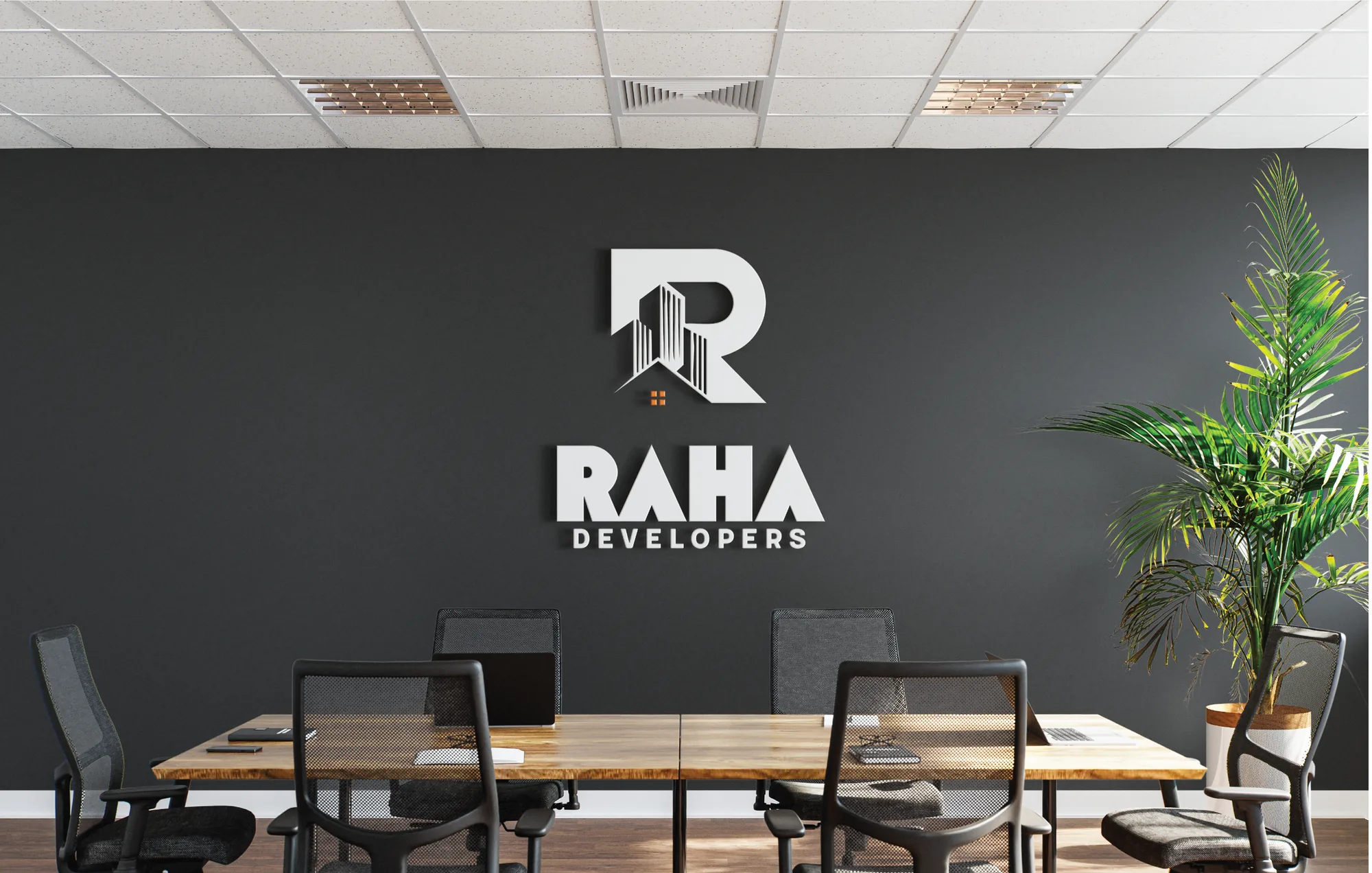
A logo for a building company. A bold R is carved into a row of towers with a small house window in orange, above a heavy, confident wordmark.
- Client
- Raha Developers
- Year
- 2025
- Category
- Logo Design
- Services
- Logo Design, Brand Identity, Graphic Design
01The brief
The R is the building.
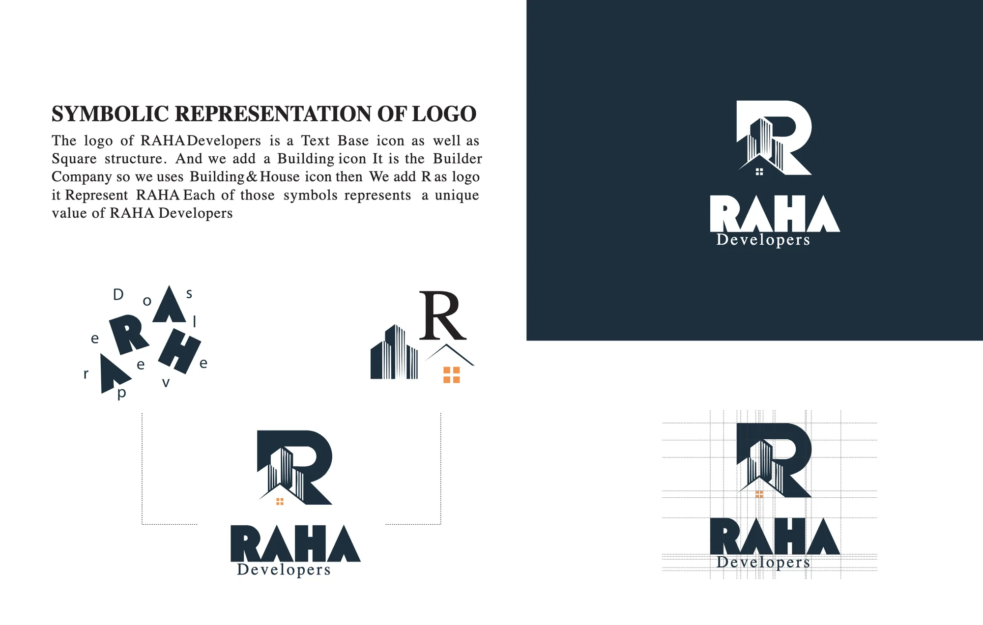
The Raha Developers logo is a text-based mark on a square structure. Since Raha is a builder, we used a building and a home icon, then wrapped them into an R for Raha. Each part stands for something the company does.
02The mark, three ways
03Anatomy
An R, towers and a home.
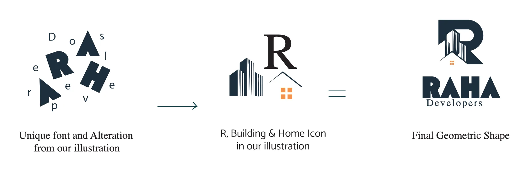
- Part 01Altered type
- Part 02R, building & home
- Part 03Final mark
04Colour systemHover to explore · click to copy
05In the world01 plates
06Deliverables
- Logo
- Primary mark with white versions
- Colour
- Raisin black and royal orange
- Type
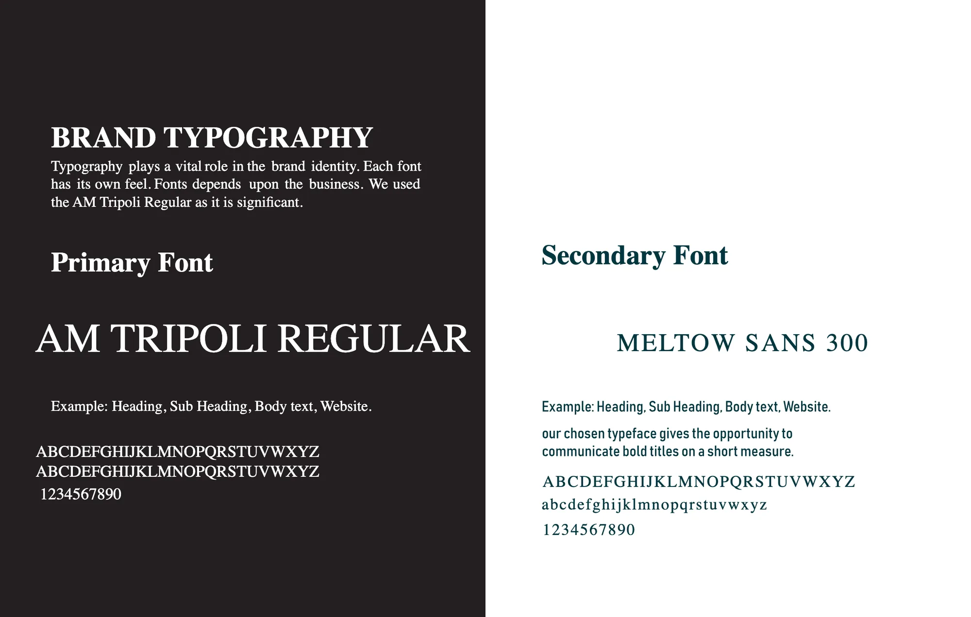
- AM Tripoli and Meltow Sans
- Mockups
- Construction site, boardroom