← All projectsCase 20 / 27
Artboard 01 · Primary mark1080 × 363
Logo Design · 2025
Dhevab Groups
Beyond boundaries across industries
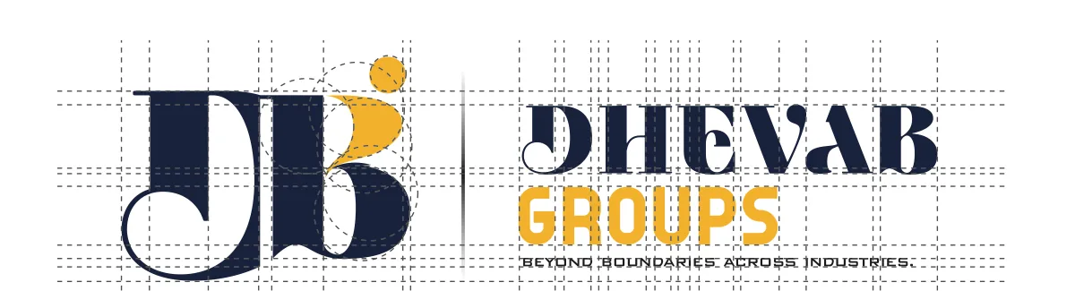
A logo for a group of companies. A dot and a flowing curve form a person in motion, tucked into a high-contrast B, beside a sharp display wordmark in navy and amber.
- Client
- Dhevab Groups
- Year
- 2025
- Category
- Logo Design
- Services
- Logo Design, Brand Identity, Graphic Design

01The brief
People, inside the letter.
The dot is a head: a person, leadership, the human element. The flowing curve beneath it suggests movement, growth and progress, and doubles as an abstract B. Built into the letter, it makes the mark more than a name: trust, innovation and human connection, for a group working across industries.
02The mark, three ways
03Anatomy
D, B and a dot.
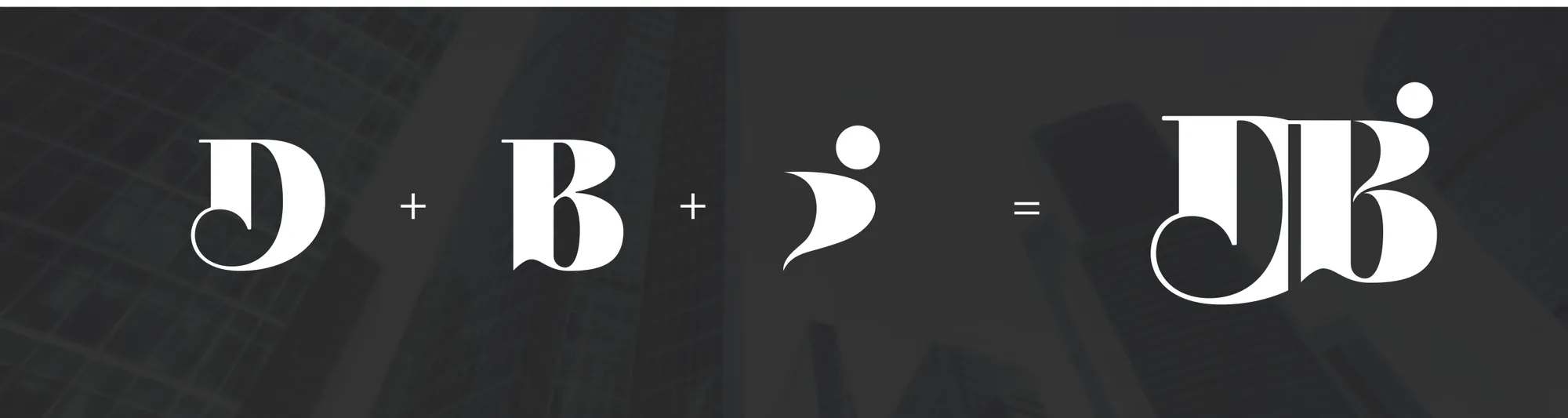
- Part 01The D
- Part 02The B
- Part 03The dot & curve
- Part 04Final mark
04Colour systemHover to explore · click to copy
05In the world05 plates
06Deliverables
- Logo
- Primary mark with white versions
- Colour
- Navy, amber and raisin black
- Type
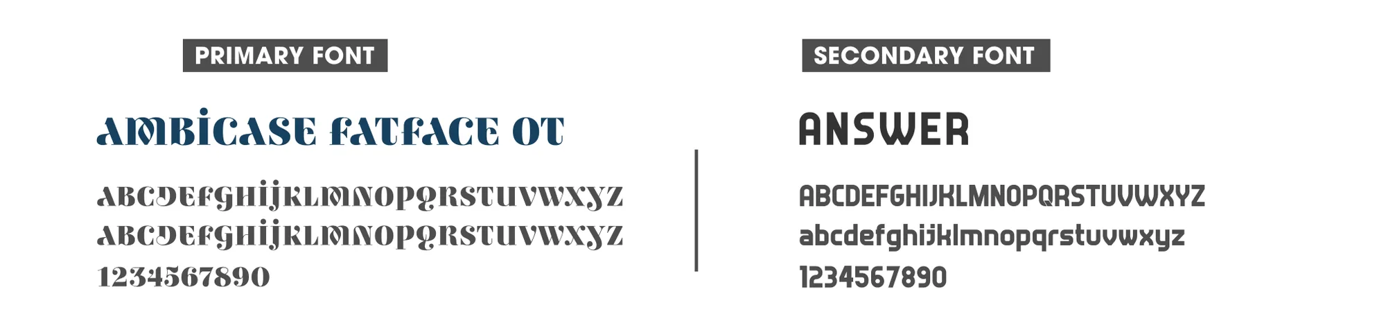
- Ambicase Fatface and Answer
- Mockups
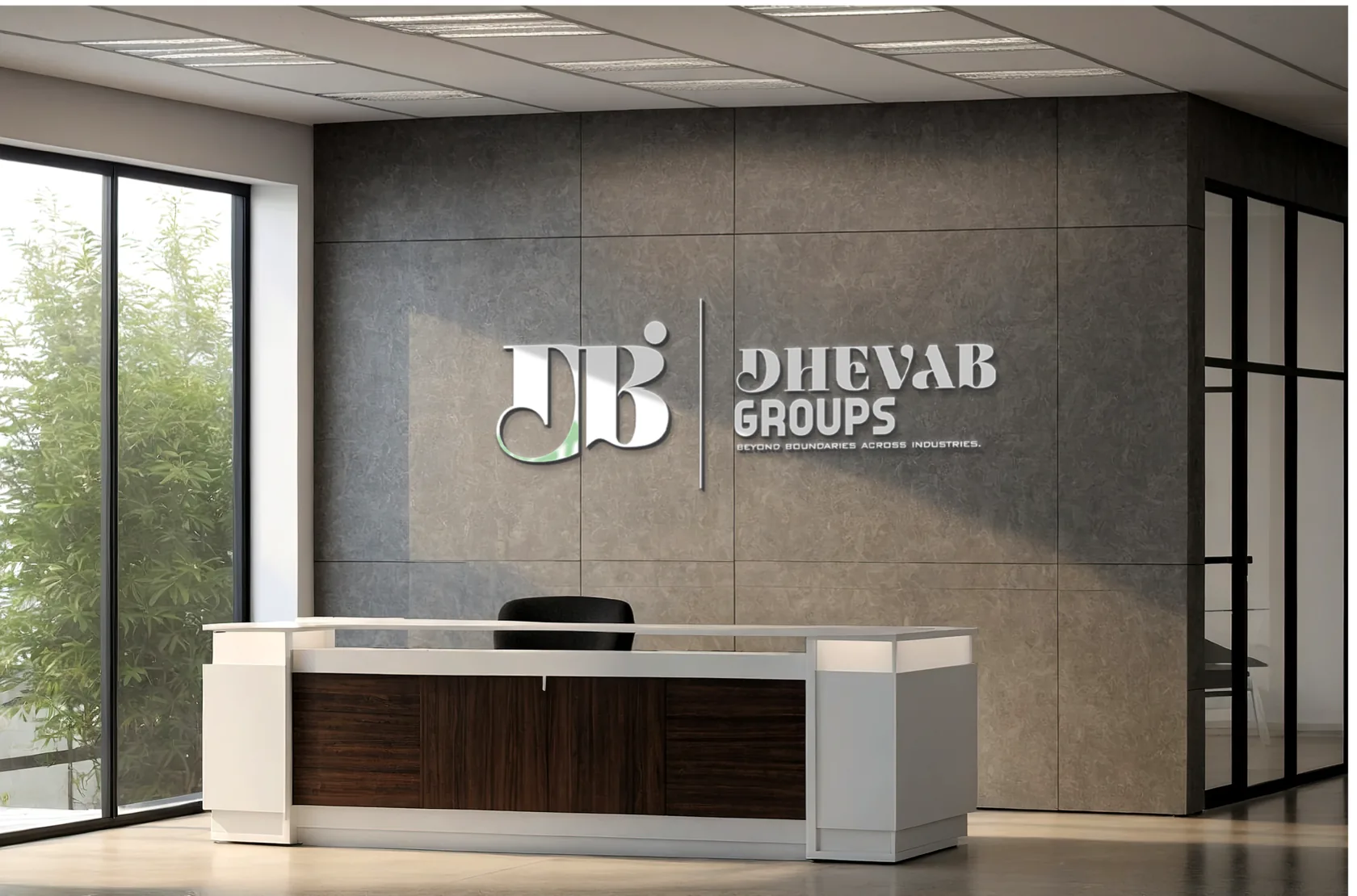
- Building, reception, billboard, stationery