← All projectsCase 08 / 27
Artboard 01 · Primary mark1080 × 678
Logo Design · 2024
Nectar
A pure divine oil brand
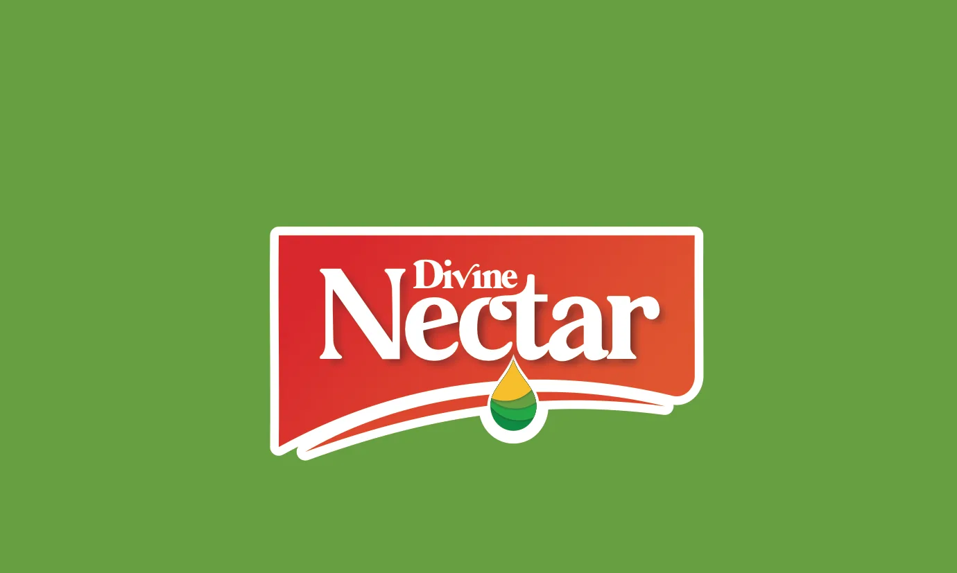
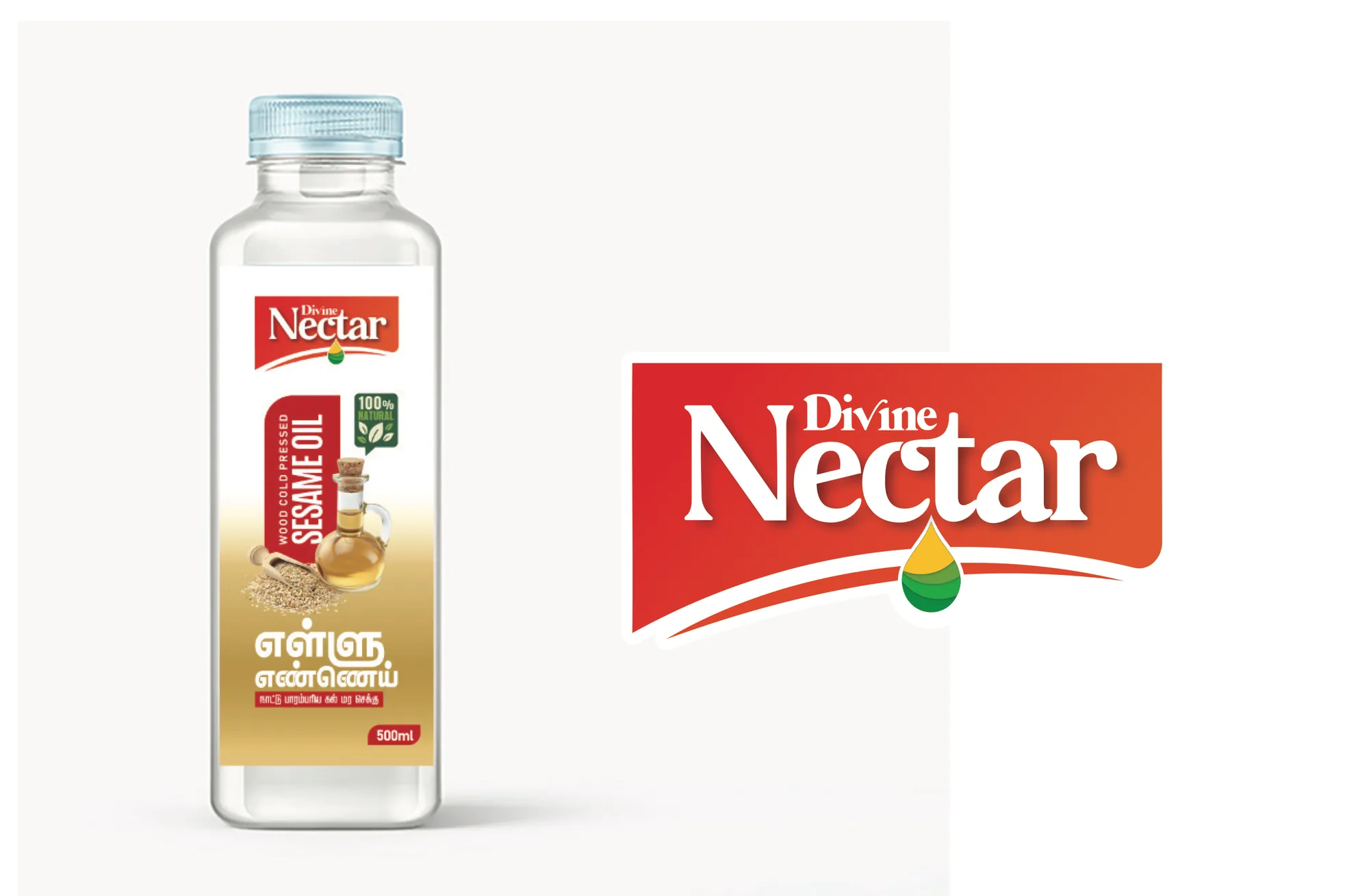
A logo for a cooking-oil brand. The wordmark sits on a red ribbon-shaped badge with a golden oil drop falling from it, so the mark reads as fresh, rich and pure on any bottle or shelf.
- Client
- Divine Nectar
- Year
- 2024
- Category
- Logo Design
- Services
- Logo Design, Brand Identity, Packaging
01The brief
A badge that pours.
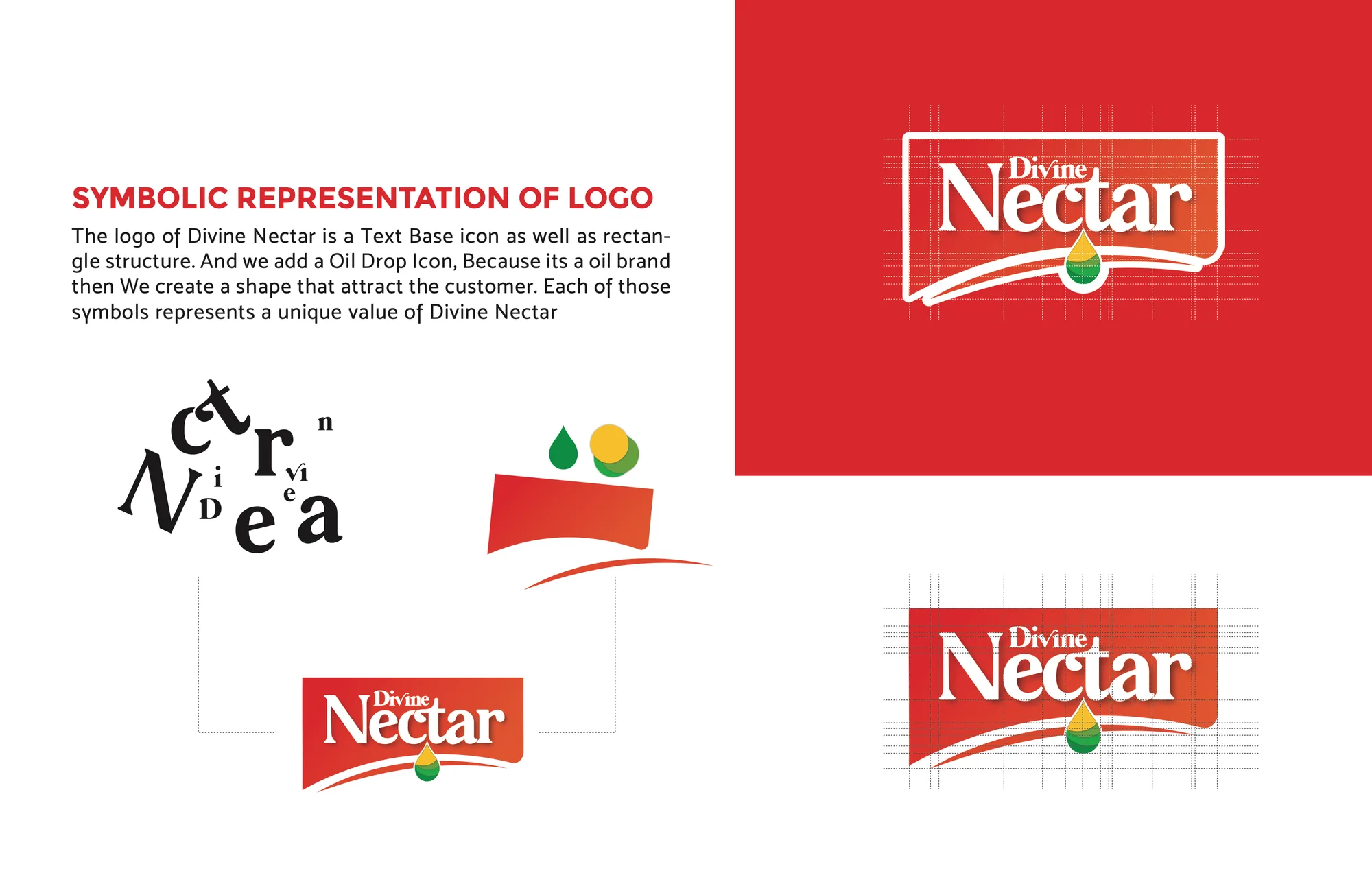
Divine Nectar's logo combines a text-based wordmark with a rectangular badge, and adds an oil-drop icon because it is an oil brand. Each symbol represents a value of the brand, and together they make a shape that draws customers in.
02The mark, three ways
03Anatomy
Letters, a drop and a ribbon.
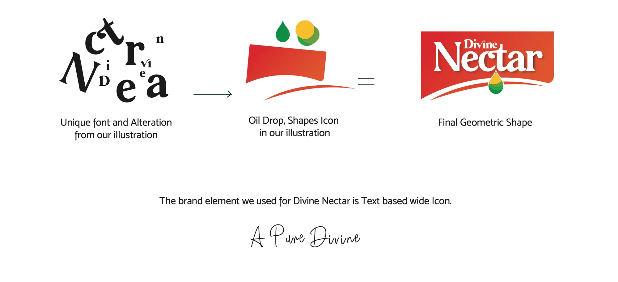
- Part 01Altered letters
- Part 02Oil drop
- Part 03Ribbon badge
04Colour systemHover to explore · click to copy
05In the world02 plates
06Deliverables
- Logo
- Badge logo with white-outline versions
- Colour
- Pigment red, Mikado yellow and apple green
- Guidelines
- Brand manual: symbolism, colour, typography
- Mockups
- Oil bottle label and brand imagery